Design Love: Store Build Out
/One of our clients came to us with an interesting project: design a kids store. We jumped at the opportunity.
Building out a store is a far different proposition than designing a new kitchen, or staging a living room for sale.
Considerations:
- Who is shopping?
- What are you selling?
- What is the best way to optimize the display to meet the needs to the customers and the business.
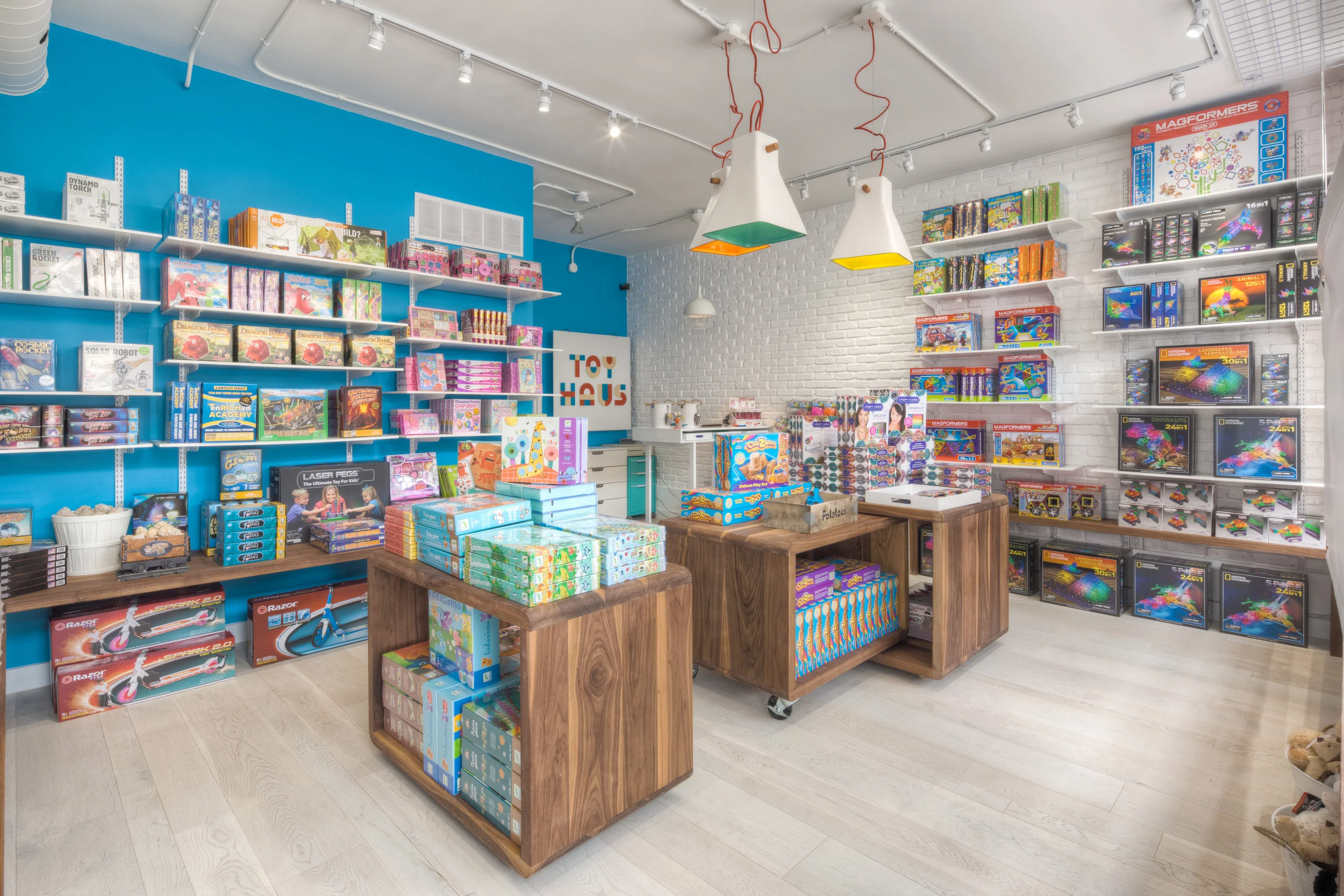
It's a toy store. And toy packaging is bright and colourful. Many boxes on shelves, little hanging. So we opted for a white store, with shelving, so that the product would be the life and focus within the space.
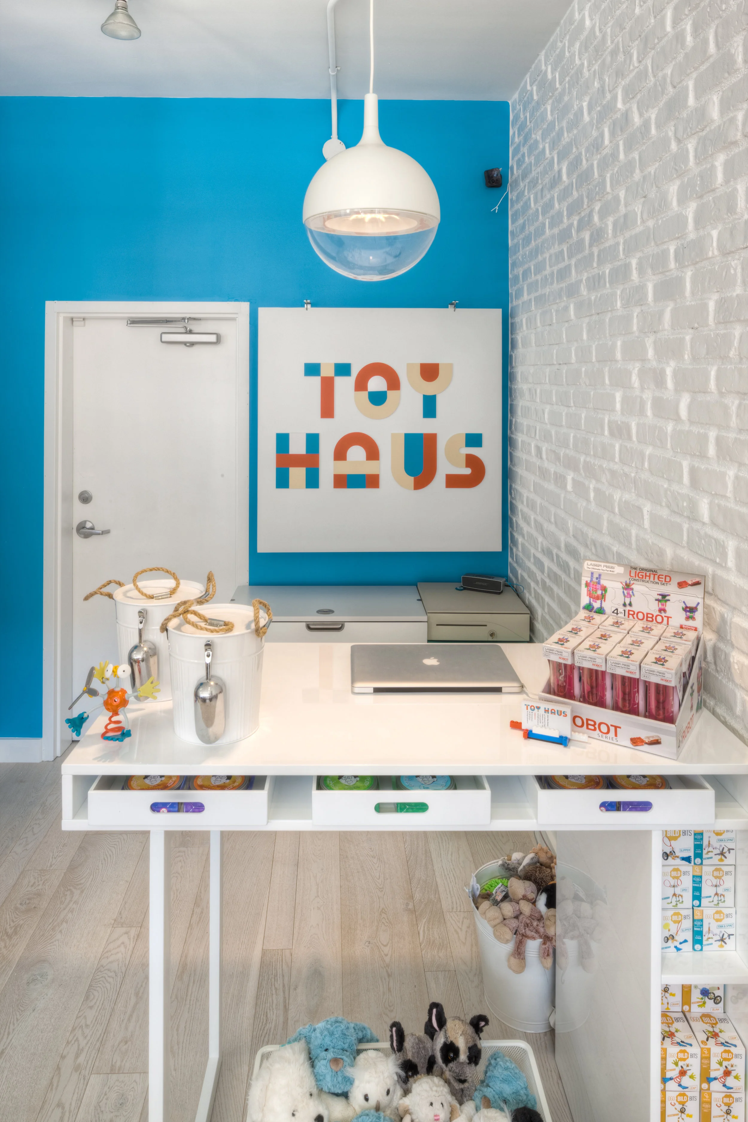
The first step was a re-brand. We worked closely with design team Boltz & Hase, who provided a beautiful, modern, building-block inspired logo.
Next, we took a look at the raw space. Check it out here:
The client wanted to add some brick for a more rustic feel and was nervous about the all white approach. So we agreed to add some walnut / wood elements in the movable floor fixtures, and paint one of the walls the same blue as was in the logo. Much to the dismay of the contractor, we had the brick tile put up, and painted it white. The result was a wonderful, bright, textured wall.
Once the product was in and unpacked, the store look amazing. The white and wood provided a neutral backdrop which highlighted the product. The lower shelves and custom walnut tables were low enough for kids to see and on castors for easy movement.


